11/30/11

The colors of Christmas....redesigning for Mr. and Mrs. Claus!

Red and green represent the Christmas season.  We thought to start celebrating the season, we would show you red and green decor.  We were trying to imagine how Mr. and Mrs. Clause would decorate their home if they were redesigning for today!
(Found at Conspicuous style interior design blog)


We can just imagine old saint Nick sitting in this chair eating a cookie and sipping hot chocolate,
or leaning over to lace up his big black boots.
(Antique& design magazine) 


The colors in this room really remind us of Christmas. Can't you see Mr. and Mrs. Claus in this room? Their favorite colors are incorporated beautifully into the decor.
(Designed by Jessi Carrie)


Perfect for their guest bedroom.
(Designed by Tucker &Marks)


Can't you imagine Mr. and Mrs. Claus in this kitchen amidst a group of elves baking Christmas cookies?  Old Saint Nick's suit would blend right into the cupboards.
(Designed by tucker &Marks)


This is the perfect color scheme to get you in the mood for Christmas.  Red and green represent the Christmas season.  A time to be focused on the holiday joy and new beginnings.  It's about relationships, family and friends.  As we are counting down to Christmas, trying to get all our shopping and projects done by the end of the year.  We hope that we all will remember the real meaning and spirit of Christmas. Wishing you all a Joyful Holiday Season!
(Deigned by Charles Spada)


11/27/11

Madeline Stuart, A good Designer has a Sense of Balance and Color.

Madeline Stuart is a L.A, California based designer.  She has a timeless approach to design.


She has a sense of balance and a keen eye for color.  Look at the patterns in the rug and how well she coordinated them with the pillows.  The navy pillows on the sofa  create a perfectly balanced background for the pillows in front of them. Every well designed room tells a story with patterns and color.


Here she has added a little color around the room so it has a soft and balanced feel.  If she would have added just one blue pillow it would have looked out of place.  By adding a couple of blue pillows on the ends of the sofas, it now works. Sometimes the simple secret is not too much and not too little.


The antique sconce and the beautiful details in the fireplace mimic the design in the hand painted border.  A good designer or artist will follow through with coordinating their project by adding similar details.  It is barely noticeable so it does not become excessive or too busy.


Look how well she coordinated the stripes and plaids.  At first you might not notice how important they are in making this room work, but they really do make this room!  A well designed room bounces the eye around the room where the designer has created interest and writes you a story through that design.  What does this room tell you?


Have you ever thought about how a room tells a story?  Like a painting, every eye might see a different story or they might have a different idea about how the artist created  his master piece.  The room as well as a great painting can evoke a myriad of feelings.  When you are looking for items for your home, what story do you want your room to tell?


11/23/11

Shopping at the Agoura antique mart and A Beautiful Mess.

The Agoura Antique mall is always beautiful at Christmas time. They have an artistic way of displaying items. Every time we go in there it is a treat!  We also went into A Beautiful Mess, which is also just  as creative with their displays. It is a great place to spend the day and have lunch at the little cafes nearby.  We hope you enjoy some eye candy and wish you all a wonderful Thanksgiving.


A Beautiful Mess
 By the way, if you stop by let them know we say hi! They are the nicest gals. They were just starting to decorate for Christmas. We will be stopping by again soon and  show you some more of their creative display decor.


There are so many things we are thankful for, family, friends and all of you.  We want to thank all of you for welcoming us into the blogging community and visiting our blog. Hope you enjoyed a little eye candy. Have a wonderful Thanksgiving.


11/20/11

Black and White Decor, like an old Hollywood Movie

There is something about black and white that is simple, but elegant.  Classic, clean, unquestionably sophisticated and elegant. Like an old Hollywood movie.
(Designed by Jennifer Ferreira)


We love old black and white movies. They are classic, like Katherine Hepburn dressed so  beautifully in Raising Baby.  Could she be talking to Cary Grant?  Notice the French bench in the back ground. This could fit right into a room designed for today.


Imagine Gloria Swanson gracefully and elegantly walking down these stairs with her Rolls Royce waiting for her.
(Designed by Lichfield).


Black and white decor reminds us of Cary Grant and Katherine Hepburn. 

Cary Grant playing the piano while Katherine looking into his eyes with her long silk dress on and her fur shawl wrapped around her shoulders.  
So sophisticated!
( Designed by Jennifer Ferreira)


The black and silver combo is also very reminiscent of old  Hollywood.
 What movie could you imagine this would
have been in?

(Jamie Herzlinger)


 Can't you see Marilyn Monro slipping on her white robe with Tony Curtis and Jack Lemmon dressed up in women' s clothing? 
 Remember the movie, "Some like it Hot"?   
The floor and the movie, true classics..

( Jamie Herzlinger)


The black painted wood work certainly makes a statement. 
 Like a man dressed in a black tie and suit. Hmmm, Rock Hudson?

(Designed by Diania Sawicki)


11/16/11

Patina Design


When we saw these pictures we fell in love with the look of the patina style.
 The old worn wood and stone walls are part of the charm.
 We wish we could own 4 homes and decorate each one in a different style. 
 One would be designed in a Patina style.  It is one of our favorites.
( Antique Shop and Designer magazine)


.


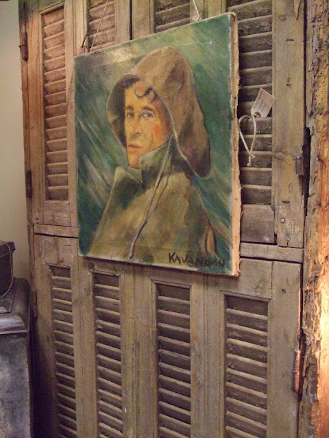
Beautiful patina blue shutters with a hanging tapestry. 
 It feels like a European chateau.
(Westbrook interiors)


 Notice as your eye looks around the room, you always seem to be brought back into the center of it. 
The wood beams and dark brown table create balance and ground the room.
(Westbrook interiors)


Designer Pam Pierce


Adore the soft blue grey patina armorie  in the back ground. 
The light blue color adds a soft element into the space. 
The chandelier adds some sparkle.
( Antique Shop ans Designer magazine)


The soft creamy white woods in this dining room create a perfect ambiance for a lovely dinner party 

 The larger check fabric on the chairs and the smaller check on the backs of the chairs catches the eye. 
 Notice the hints of blue in the rug and the painting. Pretty, huh?
(designed byJulia Blailock)


The walls are a soft blue color. 
We almost missed that! 
The furniture is the color of driftwood.
 The pillows bring a hint of a golden sunset. 
This room is quite beautiful.
(Designed by Julia Blailock )


  We love the old barn style architecture and the elegant french feel. 
 Look how the designer added the sophisticated ottoman coffee table. 
 Did you notice the baskets on the walls in the kitchen? 
 In the early 80s when we were broke and young, we would use baskets to decorate the walls.  
It was a cheap way to give our homes a designer look!
 At least we thought so. 
 Maybe if they were antique french baskets it would have looked great, like the ones on the walls of  this grand and magnificent room.  
Have you seen a come back of baskets hanging  on walls?  
We were just wondering what you thought about that look!
(Susanne Diun designs)


11/13/11

Screaming Fun! Decorating with Wallpaper!

 Have you noticed bigger and bolder wallpapers?  We have and it screams fun!  Designer,  Katheryn Ireland is known for fun . She has a talent for mixing patterns.


This dinning room is formal, but does not take its self to seriously. We love the cow hide rug. It adds a little playfulness to the room. Man, that was a big cow!
(Chambers and Chambers Architectures)


We love this  black and white bathroom. The bead board adds to the freshness. It looks like the painting might have  been painted by a family member and then causally hung on the wall.
Chambers and Chambers Architectures


(Jamie Herzlingers blog.)


Mayme Baker added this wallpaper on to the ceiling to add interest.


( Mayme Baker)


Designed by Porter designs


Designer, Melissa Rufty also is creative with pattern and color.  Wouldn't this be fun for a young girls room?


How could you ever be in a bad mood with this dinning room!  The colors would create an appetite,  not a good idea for a kitchen. We would all gain 20 pounds, but it would be great for a dinning room. It creates a mood. Company would feel at home and your food would look yummy!
(Jamie Herzlinger)


Lee AnnThornten


Dramatic, but fun
(Melissa Rufty)


Love the play on snakeskin wallpaper. Now that's fun!  What do you think about wallpaper?
Mayma Baker


One Kings Lanes

Related Posts Plugin for WordPress, Blogger...