7/27/11

The Manor House...


Kravets fabrics in blue and white for the pillows work perfectly with this traditional living room.


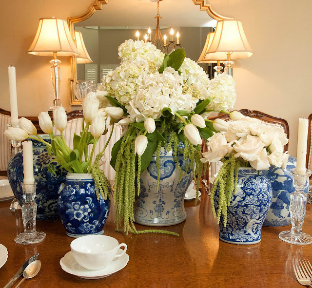
The Chinese vases always make an elegant and classic table-scape.


Our fabulous florist Marcia went over the top for us with the floral arrangements


The Chandelier is from Curry and Co.


We love this twig table!


7/22/11

Veranda's House of Windsor designer showcase home


The House of Windsor designer home will be in the October issue of Veranda.  We were  thankfully able to get permission to take pictures and blog about it.  They did not want any photos where you could see the whole room , or of rooms featured in the magazine.  Thus, we could only take close up vignettes. This first one is from the entryway.  It is a beautifully classic table scape.  The silver and black even relates back to the art on the wall behind.

This guest office was designed by Peter Dunham.  It is  full of color and fun prints.

Another guest room .  I would be quite a comfortable guest here indeed.

Great bedding.  Boys room designed by Windsor Smith.

This Master suite was designed by Candace Barnes.  I loved this whole wing of the house. The scale and use of color showed her sensibilities as a true artists.

Just wonderful mirrors in all the bathrooms.

Gorgeous!!!    No, not me in the mirror,   the bathroom.

Fabulous mantle and mirror

My granddaughter, the budding designer,  images go on and on in the twin mirrors of the music room. What a playful room.

Kathryn Ireland used her fabrics in designing the stable. Not like any stable I ever visited.  Lovely soft palette and beautiful patterns.

This lighting was just incredible in every room. Unique fixtures everywhere. This one seemed like an art sculpture orbiting the room.


 Veranda

7/21/11

Fireplace ideas


We are working with a client and helping her design her family room.  Here are some ideas for her fireplace.


Love the warmth of this room.  The stone fireplace adds charm.
This fireplace becomes the focal point of this room.  Don't you just want to crawl into bed with a glass of wine?


image one / two / three / four

7/13/11

We love Kathryn Ireland!!!


loving the contrast of rooms. One is predominantly soft hues, while the other uses bold patterns and color.


We love how Kathryn Ireland puts fabrics together. She uses color and pattern like a true artist!

One Kings Lanes

Related Posts Plugin for WordPress, Blogger...